
Camp Sprout
Project Specifications
Camp Spout wanted a logo that was simple, would be easily recognizable, and would work on a variety of products and materials. They wanted a rounded, friendly typeface and muted color scheme. A custom pattern and a handful of icons was also requested.
Camp Sprout is gathering place for kids and families to experience all things outdoors. Whether it’s camping, fishing, rock climbing, or hiking, Camp Sprout is full of experienced staff to make the learning process easy, judgement-free, and fun for everyone!

Primary Logo
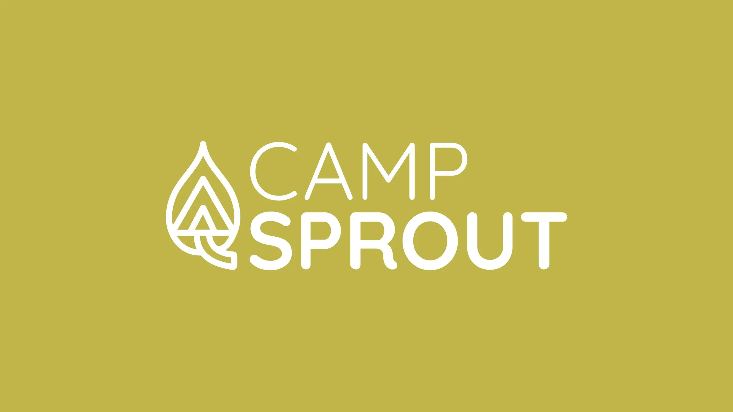
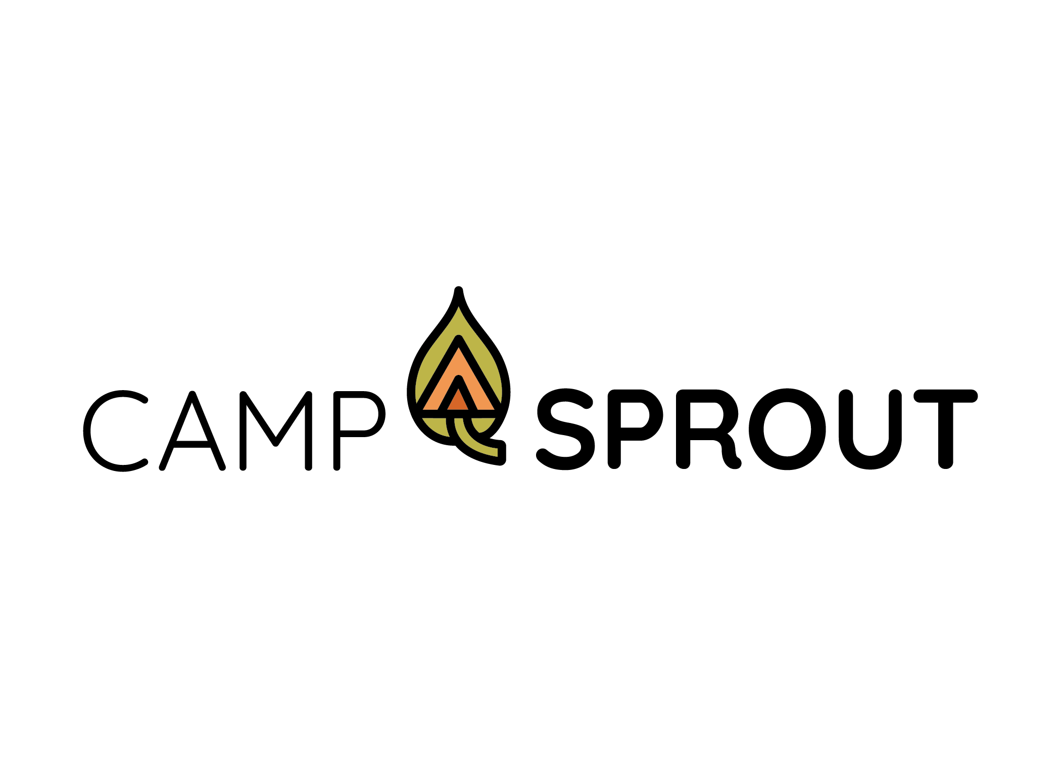
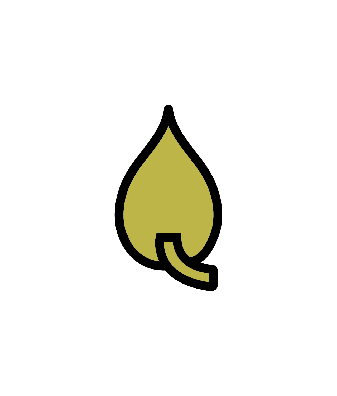
The Camp Sprout logo captures the spirit of early exploration and growth with a warm, nature-inspired mark that feels both playful and grounded. At the heart of the design is a stylized leaf icon that doubles as a tent and sprout — symbolizing both outdoor adventure and new beginnings. The simplified shapes and bold black outline give the mark a timeless, illustrative quality, while the soft olive and muted orange palette evokes earthy warmth. Paired with clean, approachable typography, the logo reflects a brand rooted in nature, imagination, and the joyful wonder of kids learning through outdoor play.
Secondary Logos
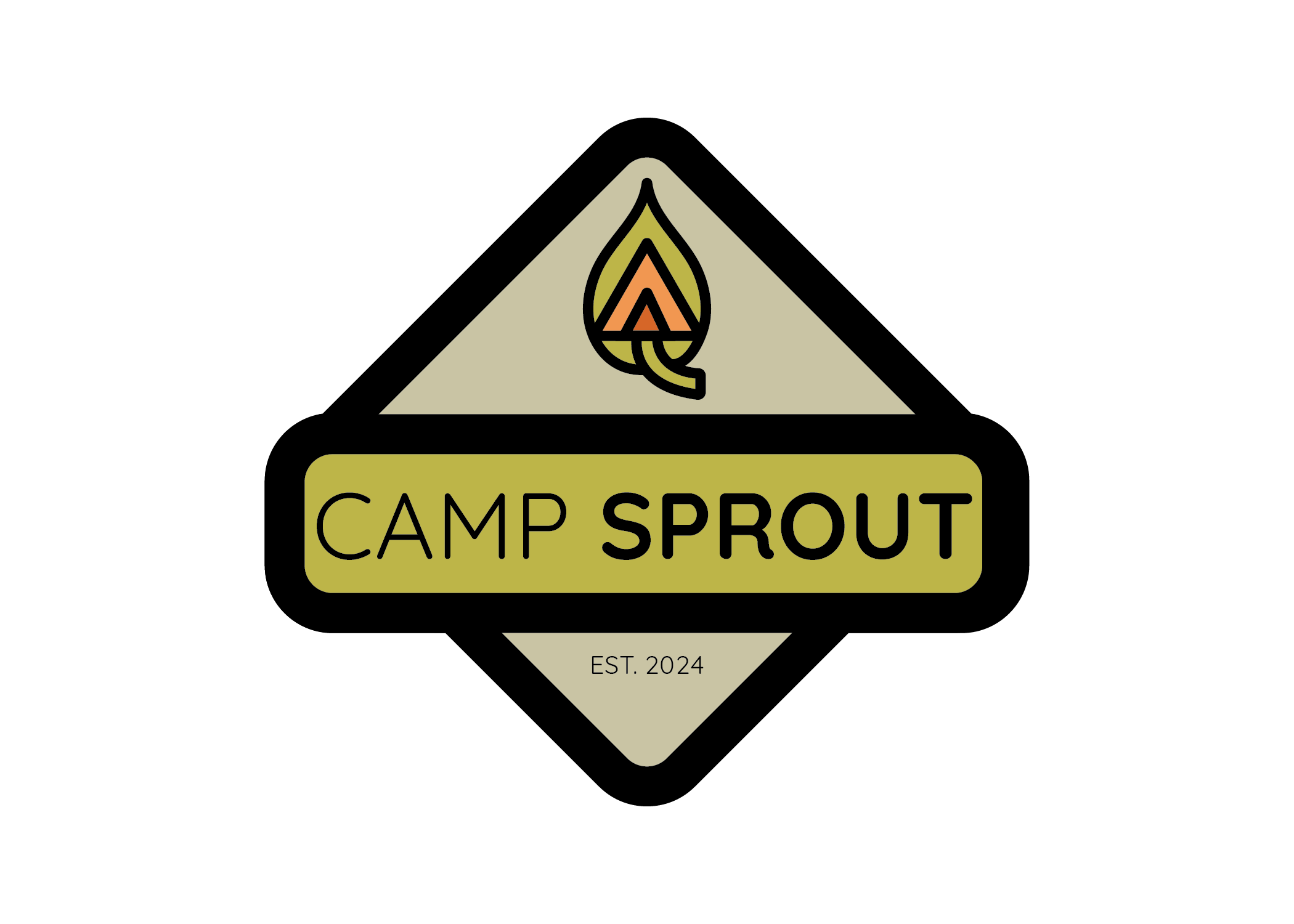
The horizontal version of the primary logo utilizes the Camp Sprout icon in the center with the text on each side. The badge option is great for signage, hats, or other materials.

Colors
The color palette for the Camp Sprout logo was carefully chosen to reflect a sense of growth, warmth, and connection to nature. The olive green shows the strong connection to nature. The soft, muted orange adds a friendly, uplifting energy, giving the brand a sense of warmth while the darker orange adds a bit of bold contrast to the design. Black was chosen for the outline color to add structure, helping the mark feel bold, clear, and timeless.

Typeface
This client requested a friendly typeface for the logo, and Quicksand is just that! Quicksand is modern, rounded, and friendly. The typeface also has several different weights which made it the perfect choice for the Camp Sprout logo.

Icons
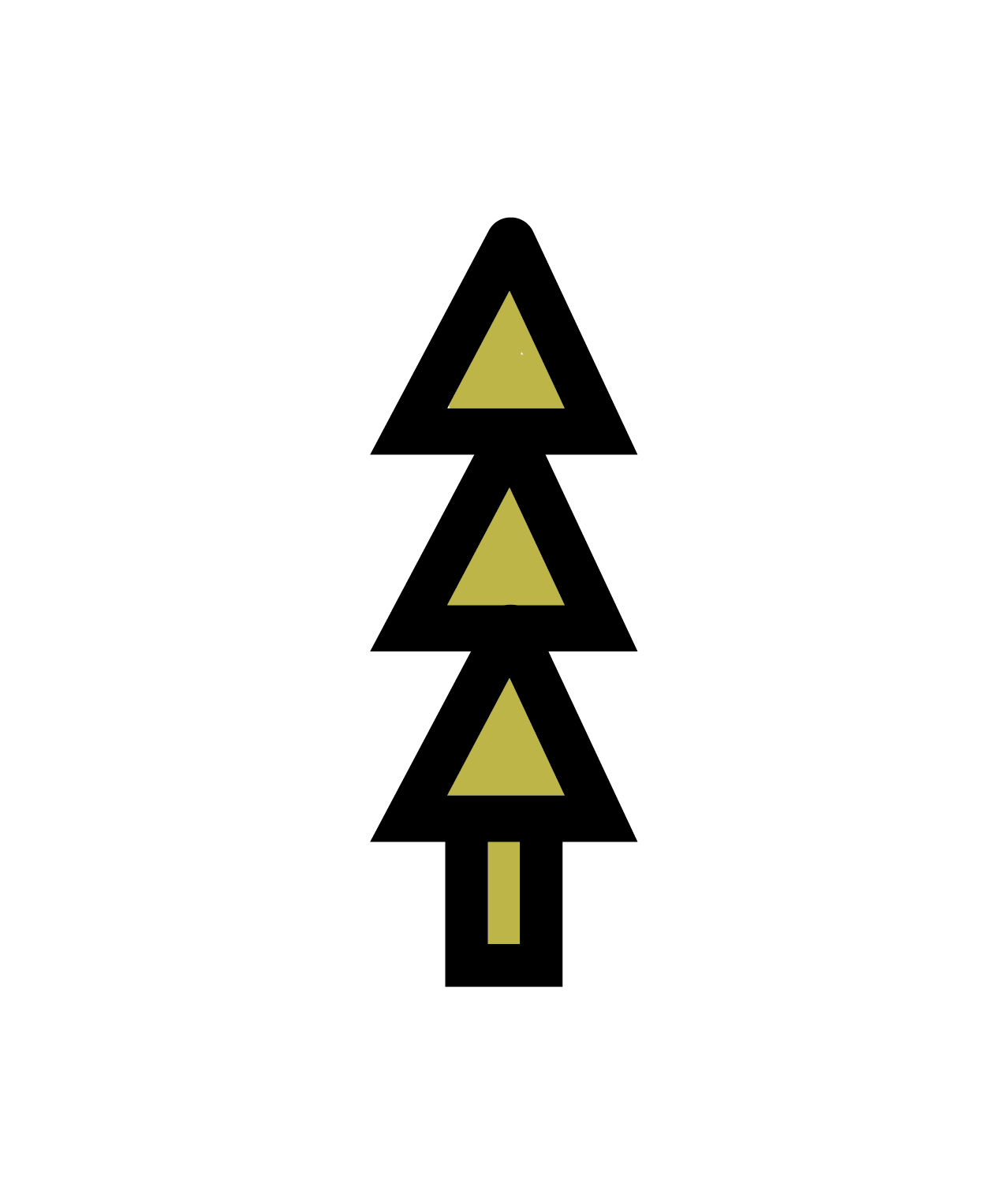
Camp Sprout was needing a handful of icons to go along with their brand. It was decided to use the small triangle in the primary logo to create a pine tree icon. The other two icons are pulled from the primary logo. Icons can be used on a wide array of projects including signage, publications, social media and more!

Pattern
The main pattern for Camp Sprout uses the muted green from the color palette and triangles from the tent to create a fun, repeating pattern. Patterns are essential to a successful brand design. These items can be used for social media or website headers, backgrounds of print materials, and more!