
Lip Ripper Fishing
Client Background
Lip Ripper Fishing has been a long-time client. Over the years projects have included a logo design, business cards, gift cards, rack cards, a media guide, social media graphics, and many branded photoshoots across the state of South Dakota.

Primary Logo
The primary logo features a bold, modern sans serif typeface with two contrasting weights to establish clear visual hierarchy. A custom fish hook element integrates seamlessly into the “R,” anchoring the design and creating a natural space beneath the main text for the word “Fishing.” The use of blue, requested by the client, reinforces the brand’s strong connection to water and the aquatic nature of the business.

Secondary Logo
The secondary logo keeps the main element of the hook along with the “L” and “R” for Lip Ripper Fishing. This version of the logo works perfectly for hats, the front of shirts, or other places where the horizontal logo does not work.
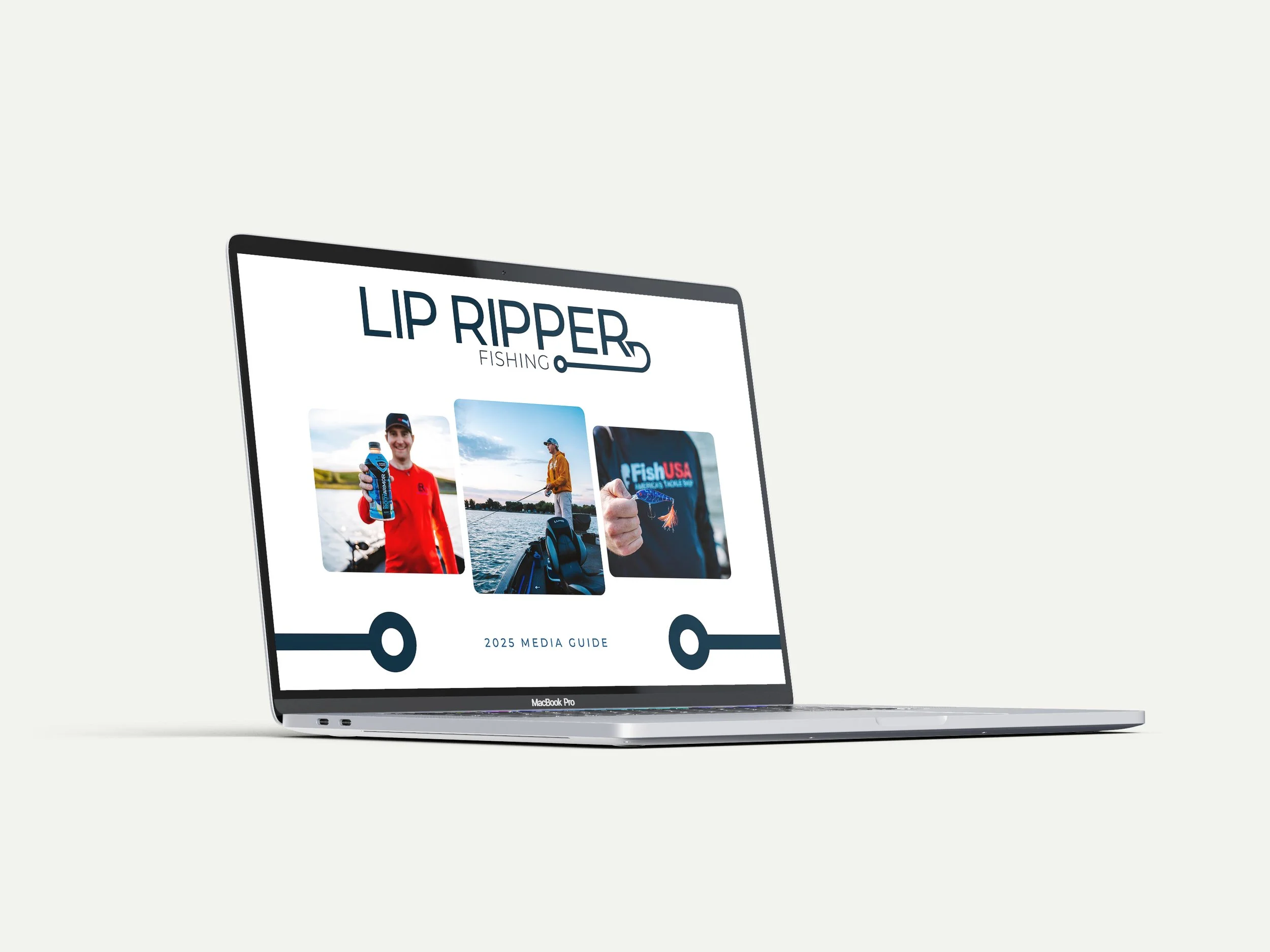

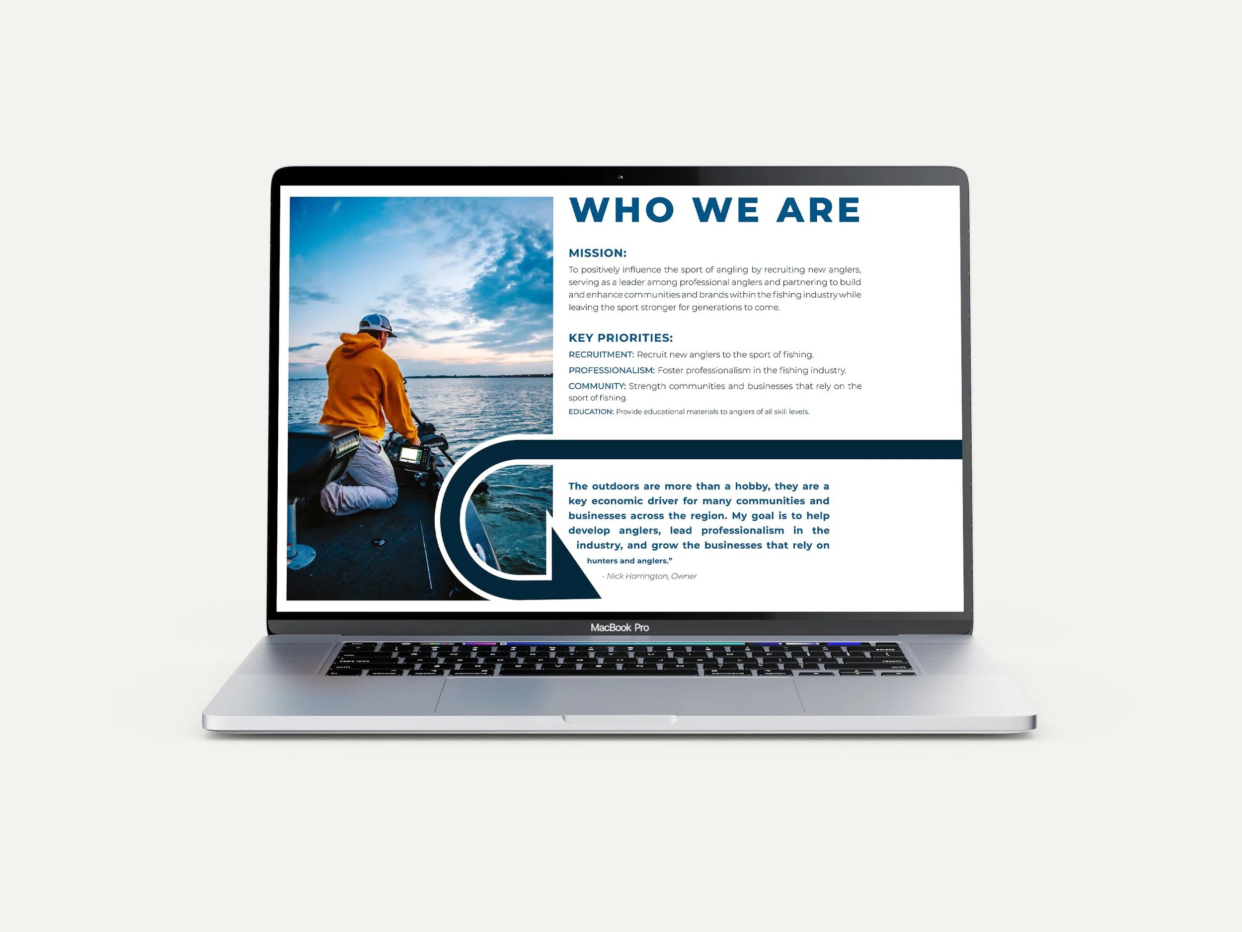
Digital Media Guide
The client requested a digital media that he could email prospective businesses and brands in order to receive sponsorships. The media guide contains information about Lip Ripper Fishing, social media and website analytics, tournament statistics, and sponsorship opportunities.


Website Graphics
The client runs a high-traffic blog and wanted custom graphics for two recurring series: the Weekly Fishing Report and the League Report. Previously, each post relied on photo-based cover images, which became challenging to source consistently. These new graphics not only solved that issue, but also created visual consistency and helped break up the blog’s layout, making it easier for readers to navigate and recognize recurring content.